Dashboard
FraudScore Dashboard - the starting page for any integration. Here, you can obtain all the necessary information regarding the analysis results of your traffic.
Timeline and Pie Chart
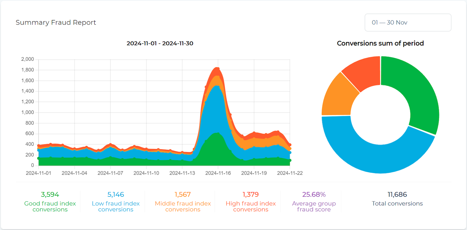
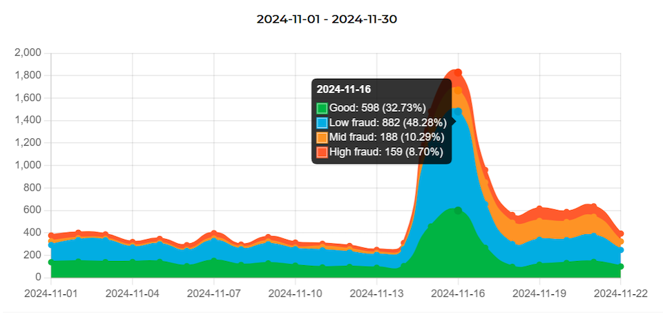
The Dashboard provides a summary of all analyzed conversions. On the timeline, you can view a graph of your conversions, divided into color-coded zones corresponding to risk levels:
 - non-suspicious traffic;
 - low risk level;
 - medium risk level;
 - high risk level.
Hover the mouse cursor over a point on the graph to see detailed information about the conversions.
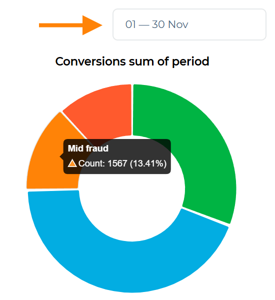
The chart on the right visualizes the proportion of conversions for each zone, aggregated over the selected period. Hover the mouse cursor over a colored segment to view the exact number of conversions in that zone and the percentage of the total.
To select the period for which statistics should be displayed, use the corresponding field above the chart. By default, the period for the last 7 days is offered.
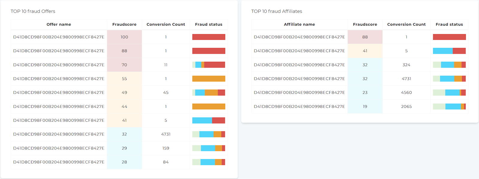
Top 10 Offers and Affiliates
At the bottom of the Dashboard, you will find a table TOP 10 fraud Offers and Affiliates. This is a list of Offers and Affiliates, sorted by the Fraudscore value.
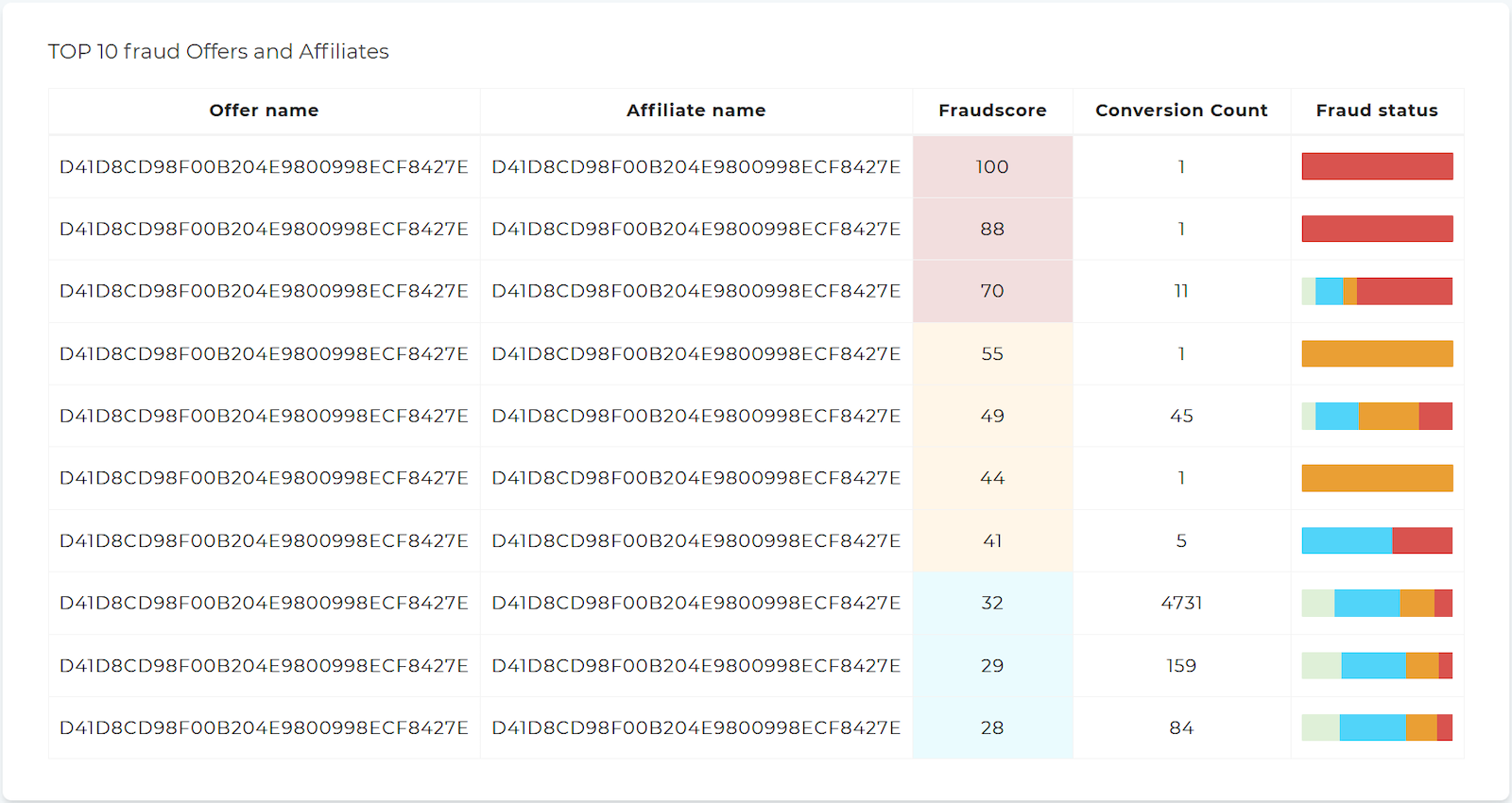
The table includes:
OffersandAffiliates;Fraudscore;- Number of conversions;
- Bar chart showing the proportion of conversions by risk levels (hover the mouse cursor over a colored area to see detailed information about the quantity).
Below are two additional tables: TOP 10 fraud Offers and TOP 10 fraud Affiliates. These are separate lists of Offers and Affiliates, sorted by the Fraudscore value.